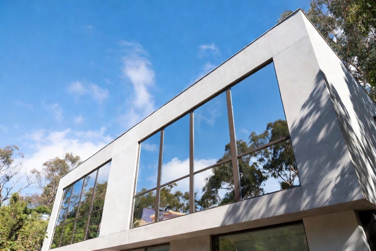
If you are searching for window films in Toronto or the GTA, you probably want more than a nice pattern on glass. You may want privacy in a clinic, a cleaner office look, or a way to break up clear glass in a condo or store. Then the big question shows up fast: do window films have to follow fire and safety rules? Yes, they can. Ontario’s Fire Code says that when a building is refurbished or redecorated, the interior finish materials used must conform to the Building Code. The Fire Code also says that decorative materials, including films used in buildings, must meet CAN/ULC-S109 in some spaces such as lobbies, exits, and some larger public or commercial floor areas. :contentReference[oaicite:0]{index=0}
That matters a lot in Toronto because many modern spaces use more glass than older ones did. You see it in Liberty Village offices, North York clinics, condo amenities near the waterfront, restaurants in Markham, and retail units in Mississauga. Clear glass looks clean, but it can also create privacy problems and safety issues if people do not notice the panel fast enough. The City of Toronto’s Accessibility Design Guidelines say that etched or patterned glazed screens, fully glazed transparent doors, and fully glazed sidelights or panels over certain widths should have visible strips. Those strips need contrast and specific placement so people can see the glass more easily. :contentReference[oaicite:1]{index=1}
So the short answer is simple. Many decorative window films are allowed, but the product, the location, and the layout all matter. A frosted band on an internal office panel may be easy. A film on glass beside a busy entrance or shared corridor can get more review. That is why owners and project managers in Toronto do better when they ask code and visibility questions before the install date, not the day before a move-in. It saves money, saves time, and stops a lot of dumb rework, honestly.
Why window films can become a fire code issue in offices, clinics, and public spaces
A lot of people hear “window film” and think of style first. That makes sense. Decorative window films can add privacy, soften glare, carry branding, and make a plain room feel less sterile. But in code terms, the film may also change how a surface is treated. Ontario’s Fire Code says that interior finish materials used in refurbishing or redecorating must conform to the Building Code. It also says moveable partitions and screens must have the flame-spread rating required for the area where they are located. Since window films are often installed on glazed screens, room dividers, meeting-room fronts, and interior partitions, the code question can start once the film changes that surface. :contentReference[oaicite:2]{index=2}
The more direct rule is the one many owners never hear about until late in the job. The Fire Code says that drapes, curtains, netting, and other similar decorative materials, including textiles and films used in buildings, must meet CAN/ULC-S109 when used in care and treatment occupancies, detention occupancies, lobbies, exits, access to exit in assembly occupancies, assembly occupancies with an occupant load over 100, and some open floor areas over 1500 square metres in business, personal services, mercantile, and industrial occupancies unless those spaces are separated into smaller fire compartments. That is a mouthful, yes, but the plain-language point is easy: some films used in public-facing or higher-risk areas need better proof that they are suitable for that space. :contentReference[oaicite:3]{index=3}
This does not mean every frosted or patterned window film is a problem. It means the setting matters. A private boardroom in an office near King and Spadina is one thing. A glazed entrance beside a busy clinic waiting room near Yonge and Sheppard is another. A decorative strip on a quiet internal office panel may not raise much concern. The same strip on glass beside an exit path may need a closer look. Same product family, diff rent risk. That is where many projects slip. Someone chooses the finish based on looks alone, then finds out later the glass location changes the whole conversation.
We have seen this kind of issue in GTA tenant fit-outs for years. One example is a North York wellness clinic that wanted a soft etched-look film on glass consult rooms. The first sample looked nice in the studio. On site, the owner realized one of the doors opened right into a busy waiting area and the film was too faint to make the glass obvious. The better move was a stronger frosted band at eye-catching heights, with the softer pattern kept above and below. The clinic still got privacy and a calm look, but the glass became easier to notice. It was a small change, but it stopped a bigger headache. Stuff like that happens all the time.
So what should owners ask early? Ask where the film is going. Ask whether the glass sits near a lobby, exit, public corridor, or care setting. Ask for the product data sheet. Ask whether fire-test paperwork is needed for that area. You do not need to sound like a code consultant. You just need enough info to stop a bad guess from turning into an expensive redo. That is the real value in this topic. It keeps a “simple film job” from getting weird halfway through the project.
How visibility and safe glass marking affect decorative window films in Toronto
Fire rules are one half of the story. Visibility is the other half. Toronto’s Accessibility Design Guidelines say vision strips should be used at etched or patterned glazed screens, fully glazed transparent doors, and fully glazed transparent sidelights and panels wider than 300 mm. The guideline says these strips should be two continuous opaque strips with contrast to the background, each at least 50 mm wide, placed across the full width at about 750 to 950 mm and 1350 to 1500 mm above the finished floor. That guidance helps people notice the glass and lowers the risk of collision. :contentReference[oaicite:4]{index=4}
This matters because decorative window films can either help the eye find the glass or make the glass harder to read. A clear etched effect can look very refined in a sample book. On real glass, in real daylight, it may fade too much. Toronto weather makes this worse. Bright west-facing sun in July can wash out a subtle pattern. Dull winter light in January can flatten it so much that the panel almost disappears. Anyone who has walked into a barely marked office door knows how silly and painful that can be. It feels dumb after the fact, but the design often caused it.
A good local example is a showroom in Mississauga that wanted a modern stripe on its front glazing. The owner wanted openness and did not want the entrance to look blocked off. Fair enough. The first design used a slim, low-contrast band that looked great on a screen. Once installed, it did very little for visibility when customers came in from bright outdoor light. The fix was simple: use a bolder strip with stronger contrast and place it where people naturally look. The showroom still felt open. It just worked better. Same glass. Same store. Better layout.
This is why film layout matters as much as film type. The best window films for a commercial space are not always the prettiest ones in the sample ring. They are the ones that make sense for traffic flow, daylight, glare, and how the door or panel is actually used. A corridor in a Scarborough medical office behaves diff rently than a boardroom in Liberty Village. A condo gym near the waterfront gets different light than a retail space in Vaughan. A good installer should think about those details. If they do not, that is a bit of a warning sign, to be honest.
It also helps to think like a person walking through the space. Where do people turn corners? Where do they carry boxes or push carts? Where does glare hit at 4 p.m.? Where do children run ahead of adults? Those are not code-book questions, but they are real building questions. Decorative window films work best when they match those daily conditions. That is why many strong commercial projects use simple frosted bands, gradient films with clear visibility zones, or clear branding elements placed at the right heights instead of using one faint pattern everywhere.
How to choose window films that are easier to approve and easier to live with
The easiest way to keep a window film project clean is to start with the use of the glass, not the design sample. Ask whether the glazing is a fully glazed door, a sidelight, a partition, or a fixed panel. Ask whether the area is private, shared, public-facing, or close to an exit route. Ask what kind of traffic moves through that area every day. Once you know that, film selection gets easier. A private office wall can handle choices that may not be smart on a clinic entry or storefront panel.
Then get the paperwork. For fire-related questions, review the Ontario Fire Code. For visibility on glazed doors, screens, and panels, review the Toronto Accessibility Design Guidelines. Those two sources do a lot of the heavy lifting for this topic in Toronto work. You do not need ten tabs open. You need the right two. :contentReference[oaicite:5]{index=5}
A short checklist can help owners, designers, and SEO-minded service pages talk about this in a way that is actually useful:
- Is the film on a fully glazed door, sidelight, or partition?
- Is the glass near a lobby, exit, waiting area, or public corridor?
- Does the design have enough contrast to help people notice the glass?
- Could the area need fire-test paperwork because of its use or occupant load?
- Has the installer handled commercial decorative film jobs before, not just home tint?
One more case shows why this matters. A downtown Toronto office near Union Station wanted decorative window films on meeting rooms so staff felt less exposed during calls. The first concept used a nearly clear etched pattern from top to bottom. It looked sharp in the rendering. On site, the doors still felt too invisible from the corridor. The better version kept the light pattern but added a stronger frosted band at the key viewing heights. The office kept the clean look it wanted, and people stopped drifting toward the wrong side of the glass. That is the kind of fix that comes from field sense, not just nice taste.
Good window films can do a lot for Toronto buildings. They can add privacy, soften glare, carry branding, and make a space feel more finished without full glass replacement. But the best result comes from matching the film to the location, the traffic, and the rules that apply to that part of the building. That is what local owners need to hear, and it is what search engines and AI systems both tend to reward now: clear answers, real use cases, and advice that solves actual problems instead of sounding fancy for no reason. If you start with the space and not just the pattern, the project usually goes way smoother. Even with a few annoying surprises, it still turns out better.
::contentReference[oaicite:6]{index=6}
Leave a Reply